Good web design is not about how a website looks. It is about how quickly a visitor understands a page, trusts it, and acts. The web design principles that matter most, visual hierarchy, whitespace, readable typography, deliberate colour, fast performance and a clear next step, are the ones that turn attention into enquiries and sales rather than bounces.
Web design principles are the repeatable rules that make a website easy to understand and act on: visual hierarchy, whitespace, typography, colour and contrast, mobile-first layout, performance and clear calls to action. Applied together, they turn a good-looking site into one that converts.
At a glance, the principles that decide whether a website performs:
- Visual hierarchy: guide the eye to the most important element first.
- Whitespace: give the layout room to breathe and be scanned.
- Typography: make text effortless to read.
- Colour and contrast: direct attention while staying accessible.
- Mobile-first: design for the smallest screen, then scale up.
- Performance: treat speed as a design decision, not an afterthought.
- Clear calls to action: make the single next step obvious.
- Consistency: reuse patterns so visitors never relearn the page.
Why do web design principles decide whether a website converts?
Web design principles decide conversion because visitors judge a website in under a second and leave when a page is confusing, slow or hard to read. Research consistently puts a first impression at around 50 milliseconds, long before anyone reads a word, so the visual signals a design sends carry most of the weight.
Sound web design lowers the effort a visitor spends to understand a page and act on it, and lower effort is what turns a visitor into a customer. A useful shift is to treat design as a job to be done rather than a picture to be admired. Every element, the layout, the colour, the wording, should be measured against one question: does this help the visitor move towards the goal, or is it just there to look busy? A striking hero image that pushes the actual message below the fold is decoration that costs conversions.
Which web design principles matter most?
The web design principles that matter most are visual hierarchy, whitespace, typography, colour and contrast, and consistency. Visual hierarchy controls the order in which the eye reads a page, and the other four decide how easily a visitor can read, scan and trust what they see.
Visual hierarchy
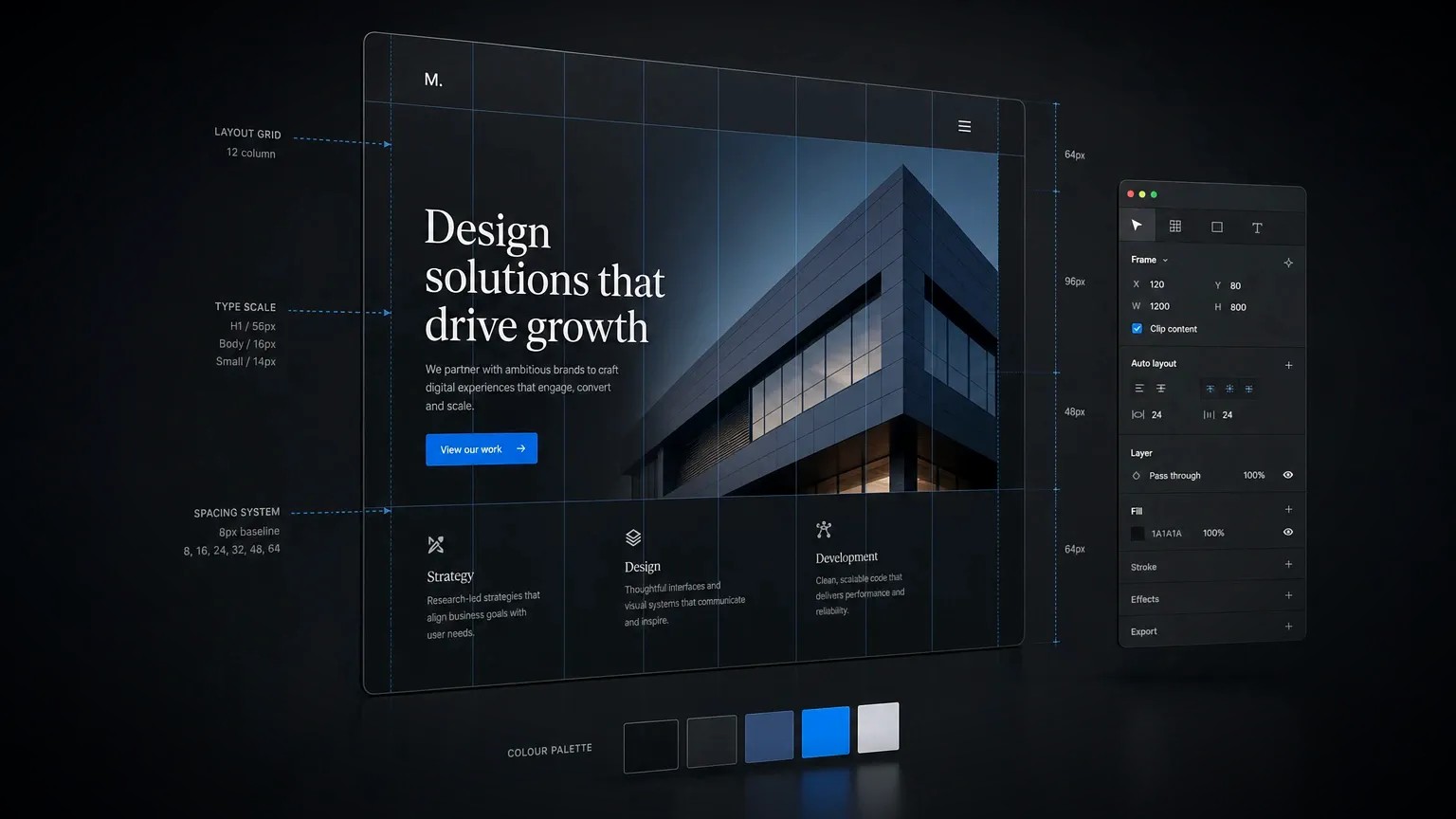
Visual hierarchy is the order in which the eye moves through a page, controlled by size, weight, colour, contrast, spacing and position. The single most important element, usually the headline or the primary call to action, should be the most prominent. When everything competes for attention, nothing wins, and the visitor has to work to find the point. A quick test is to squint at a page until it blurs: the elements that still stand out are the ones carrying the hierarchy.
Whitespace
Whitespace, the empty space around and between elements, is not wasted space. It is what makes a page feel calm, considered and easy to scan. Space groups related items, separates unrelated ones, and gives the eye somewhere to rest between ideas. Adding generous space around a headline or a call to action often lifts its impact more than making it bigger or brighter.
Typography
Typography carries most of a website, because most of a website is words. Readable text means a body size of around 16 to 18 pixels, a line length of 60 to 75 characters, and enough line height to keep lines from crowding, with a clear heading scale so people can skim. One or two typefaces used well read as far more professional than a page of competing fonts.
Colour and contrast
Colour directs attention and sets tone, and it works best with restraint: a small palette with one accent colour reserved for actions. Contrast is also accessibility. Text should meet the Web Content Accessibility Guidelines contrast ratios so it stays legible for people with low vision and for anyone reading in bright sunlight. Designing for accessibility is not a limit on good design, it is part of it, and it widens the audience a site can reach.
Consistency
Consistency means buttons, spacing, headings and colours behave the same way on every page, so visitors learn the pattern once and stop having to think. Consistent design lowers cognitive load and builds trust, and it is far easier to maintain when a site is built from a small set of reusable components rather than one-off pages.
What are the trade-offs in web design decisions?
Every web design decision carries a trade-off, and the skill is choosing deliberately rather than by taste. The four tensions that shape most projects are aesthetics against usability, visual trends against longevity, custom design against templates, and rich animation against speed.
| Trade-off | What usually wins, and why |
|---|---|
| Aesthetics vs usability | Usability. A bold layout can stand out, but novelty that makes a page harder to use costs more than it gains, so clarity wins whenever the two conflict. |
| Trends vs longevity | Longevity. Chasing the current style dates a site quickly, while principles such as hierarchy and readability age far better. |
| Custom vs template | It depends. Custom design gives control and distinction; a template gives speed and lower cost. The call comes down to budget and how far the brand must stand apart. |
| Animation vs speed | Speed. Motion can guide attention and add polish, but heavy animation slows a page, so use it sparingly and never at the cost of performance. |
How do you design a website that converts?
To design a website that converts, work in order: define the goal, build the hierarchy around it, design mobile-first, protect performance, meet accessibility standards, and make one next step obvious. Conversion is the result of removing friction at every step, not of a single clever idea.
- Start from one goal. Decide the single action the page exists to produce, an enquiry, a sale, a booking, and design everything to serve it.
- Design mobile-first. Most visits come from phones, so start with the smallest screen. It forces the hard priorities and keeps tap targets and text comfortable.
- Build a clear hierarchy. Make the headline and the primary call to action the most prominent things on each screen, and let secondary content recede.
- Protect performance. Treat speed as a design decision. Optimise images, limit fonts and keep effects light so the site passes Core Web Vitals.
- Design for accessibility. Meet contrast ratios, keep text resizable, and make the site usable by keyboard, so every visitor can act.
- Make the next step obvious. Give each page one clear call to action, with button text that says what happens, such as "Start a project" rather than "Submit".
- Test with real visitors. Watch how people actually use the page, then remove whatever slows them down. Real behaviour beats opinion every time.
What are the most common web design mistakes?
The most common web design mistakes are prioritising decoration over clarity, crowding pages, weak contrast, slow-loading visuals, and hiding the call to action. Each one raises the effort a visitor must spend, and higher effort is the fastest way to lose them.
- Designing for the designer, not the visitor: impressive-looking pages that bury the message or the next step.
- No clear focal point: when everything is bold or large, the eye has nowhere to land.
- Text that is too small or low contrast: the quickest way to make a page feel hard and untrustworthy.
- Heavy images and too many fonts: the usual cause of a slow first load, which loses visitors before they see anything.
- A buried or vague call to action: if the next step is hard to find or unclear, most visitors will not hunt for it.
- Inconsistent styling: buttons and spacing that change from page to page read as careless, and carelessness erodes trust.
Your web design principles checklist
Before a page goes live, check it against the core web design principles below. If it passes each one, the design is doing its job: helping a visitor understand the page and act.
- One element is clearly the most important on each screen.
- Generous space surrounds the key elements.
- Body text is around 16 to 18 pixels, with a clear heading scale.
- The palette is small, with one accent reserved for actions, and text contrast meets WCAG.
- The layout works effortlessly on a phone.
- The page loads quickly and passes Core Web Vitals.
- One clear call to action tells the visitor exactly what to do next.
- Buttons, spacing and styles are consistent across the site.
Web design that follows these principles does more than look good, it earns enquiries, and the same thinking sits behind every website build.
Frequently asked questions
What are the basic principles of web design?
The basic principles of web design are visual hierarchy, whitespace, readable typography, deliberate use of colour and contrast, mobile-first layout, fast performance, clear calls to action, and consistency. Together they make a page easy to understand, scan and act on, which is what turns visitors into customers.
What makes a good website design?
A good website design makes the visitor’s goal effortless. It has one clear focal point per screen, generous whitespace, readable text, contrast that meets the WCAG accessibility guidelines, fast loading, and an obvious next step. Good design is measured by how easily it helps someone act, not by how decorative it looks. If you would like that applied to your site, get in touch.
How does web design affect conversion rate?
Web design affects conversion rate by controlling how much effort a visitor spends to understand a page and act. Clear hierarchy, fast performance and an obvious call to action lower that effort and lift conversions, while clutter, slow loading and hidden actions raise it and cost enquiries and sales.
What is visual hierarchy in web design?
Visual hierarchy is the deliberate ordering of a page so the eye lands on the most important element first, controlled by size, weight, colour, contrast, spacing and position. Strong visual hierarchy makes the headline and the primary call to action stand out, so visitors grasp the page at a glance.
How many fonts should a website use?
A website should use one or two typefaces in most cases: often one for headings and one for body text, or a single family across both. Limiting typefaces keeps a site fast and coherent, whereas several competing fonts slow the page and make the design feel less professional.